The success of any trade (including crypto) depends to a large extent on the analysis that you conduct. It is the cornerstone of getting results consistently, not based on luck.
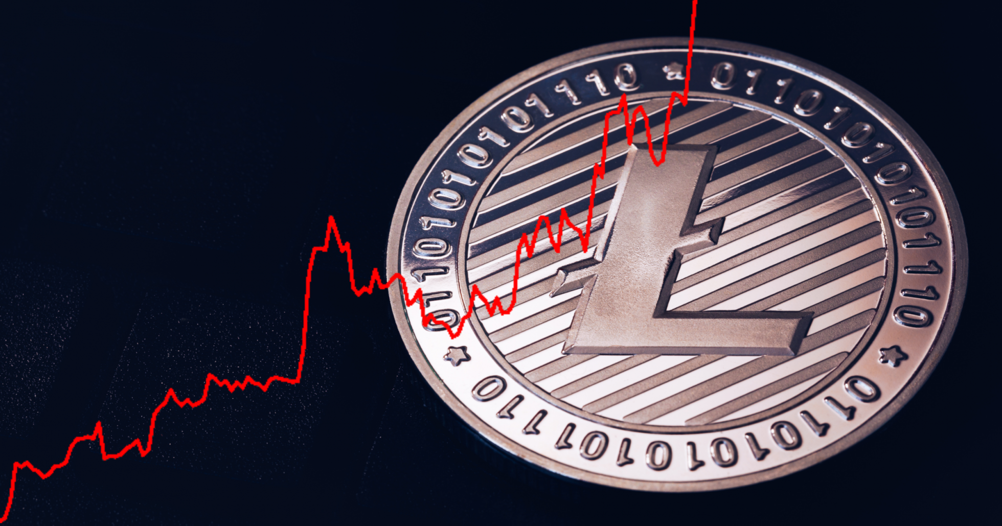
The main tools that traders use in their analysis are various charts that mostly represent the dynamics of parameters determined by both price and volume.
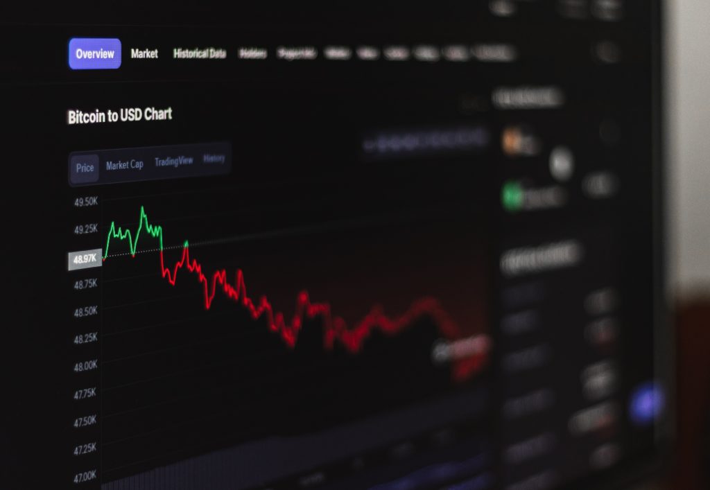
In this article, we want to cover the most common cryptocurrency charts that you see on exchanges and the tools that cryptocurrencies use in their work.
Linear price chart
Line chart

One of the most basic price charts is the line chart. This type of chart is used to get an idea of the crypto price changes over a certain period, represented by a line. The price chart is based on the cryptocurrency closing price of the day. Line charts can also have two scales: linear and logarithmic. On a line chart, the price scale is divided into equal parts.
Log chart

On a log chart, the crypto price is scaled according to the percentage change, so if two price changes differ in absolute value but are equal in percentage, they will both be represented by the same vertical shift in a log scale. With a line chart, you can better judge the rate of price change, whereas log charts are more obvious in terms of how traders see trends and cryptocurrencies.
You can often also see the volume indicator displayed at the bottom of the cryptocurrency chart. The volume shows the number of coins that have been sold over a specified period. Volume is considered the most fundamental indicator of crypto price direction. Also, it helps to understand where the price will go.
The Japanese candlestick chart
A candlestick chart is another way of representing crypto price movements. It contains more information since it shows not only the price change based on the closing price of the market but also its movement over a certain period. Each candle shows what was the highest and lowest price, which were the opening and closing prices. That is why this type of charting has gained popularity among crypto traders around the world and is preferred over line charts.

Let’s see how the cryptographic candlestick chart is made. Each candle has three parts: the upper shadow, the lower shadow, and the body. The top shadow shows the highest price, and the bottom shadow shows the lowest price. However, sometimes there are no top or bottom shadows. It is because the open/close price of a cryptocurrency is almost equal to the price of the lowest or highest level.

The body is usually colored green or red. The color depends on whether the trend was bullish or bearish; whether the closing price was higher than the opening price (green, bullish) or lower (red, bearish) at a specific time frame during the selected time.
Market Depth Chart
It gives an idea of the supply and demand situation in the cryptocurrency market. You can easily define sell (red) and buy (green) orders. The green side shows the total number of coins with buy orders at the current price, and the red side shows the number of cryptocurrencies with sell orders at the current price.

The center where the two lines meet each other represents the current market price. If you place your cursor anywhere on the green or red line, you will see how much you can buy or sell (vertical axis) at a specific price (horizontal axis).
Outcome
Reading charts for cryptocurrency is an essential skill that every trader should acquire. We hope that the main diagrams and explanations described in this article will help you to get an idea of crypto exchanges and understand that reading the diagrams is not as difficult as it might seem at first glance.